
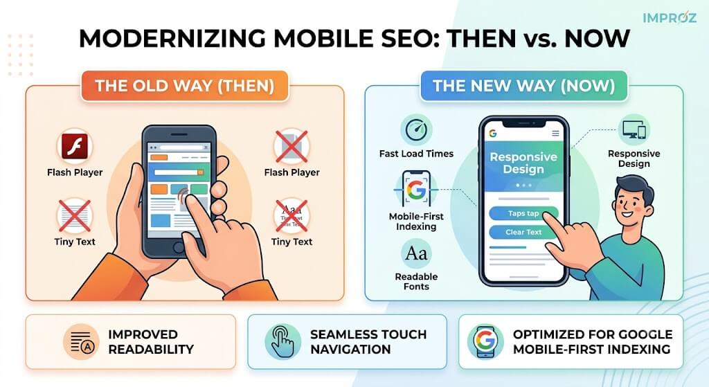
Mobile-friendliness is no longer a forward-looking recommendation; it is a fundamental pillar of how search engines evaluate websites. When Google introduced mobile-first indexing—initially dubbed “Mobilegeddon”—it marked a permanent shift toward prioritizing the smartphone user experience. If your website is not optimized for mobile devices, it will directly hurt your search rankings and cost you valuable traffic.
Many websites still run on older layouts that fail modern mobile standards. The good news is that you do not need to discard your entire web presence to fix this. By modernizing your design, ensuring fast load times, and optimizing for user intent, you can protect your search visibility and improve conversion rates.
When this update first rolled out, the main focus was simply passing Google’s automated formatting checks. Today, mobile optimization goes far deeper than just shrinking a desktop layout to fit a smartphone screen.
Google now uses mobile-first indexing, meaning the search engine primarily crawls and indexes the mobile version of your content to determine rankings for all users, even those on desktops. Furthermore, performance metrics like Core Web Vitals heavily weigh how fast and stable your page renders on a mobile connection.
The Old Way: Designing a website for desktop computers first, then adding a separate mobile plugin or basic responsive fixes as an afterthought.
The New Way: Building with a mobile-first mindset. Content, navigation menus, and media must be designed from the ground up to be lightweight, intuitive, and seamlessly accessible on a touchscreen.
While the underlying technology has evolved, the core principles of a great mobile experience remain the same. To maintain strong visibility in search results, your website must meet these criteria:
Responsive Web Design: Your layout must automatically adapt to any screen size without requiring horizontal scrolling or manual zooming.
Readable Typography: Text fonts must be large enough to read easily on small screens without straining the eyes.
Touch-Friendly Navigation: Buttons and links must have enough physical spacing around them to prevent accidental taps.
No Obsolete Software: Avoid using outdated software components like Flash or unoptimized heavy scripts that fail to load on modern mobile browsers.
Your potential customers are searching for immediate solutions on their phones. If someone searches for a local service—like a car repair shop or a medical clinic—and lands on a site that forces them to pinch and zoom just to find a phone number, they will immediately leave.
Because search engines prioritize user experience, mobile-unfriendly sites are pushed further down the rankings. With the vast majority of mobile clicks going to the top few results, a drop in mobile rankings directly translates to a drop in actual foot traffic and inbound leads.
At IMPROZ, we view mobile optimization as a core component of a comprehensive digital marketing strategy. Simply surviving an algorithm update isn’t enough; your site needs to turn mobile visitors into paying customers.
If your current website is slow, difficult to navigate, or relies on an outdated theme, our team can help. We build fast, fully responsive layouts through our structured website design support to ensure your business remains highly visible and competitive.
Ready to see how your site performs? Review our case studies to see how we help businesses grow, or get in touch with us through our contact page for a modern website evaluation.